Stuff I would change about the Mac OS X and the MacBook Pro
Quickly, let me give some relevant background. My first computer was a Macintosh that my dad bought back in 1984. Was MacPaint's lasso-command-option-drag maneuver the coolest ever? The first program I ever wrote was on that beige box -- a submarine shooting game in Basic in the back of an issue of 3-2-1 Contact. Dad spent a hell of a lot of money over the years for accessories, external drives, repairs, etc. He didn't buy a new computer until 1989.

Flash-forward to today. My boss gave me a hand-me-down MacBook Pro after a co-worker moved on to greener pastures. This thing has to be my favorite computer.
And yet, it still has many flaws. Why is it that this Mac's defects infuriate me so? Perhaps it is because except for these problems, the computer is otherwise a perfect machine -- suited precisely for my use and full incorporation into my day-to-day life -- that these flaws become glaring and obvious.
These faults are as red and raw boils on the otherwise healthy body of bliss gotten from owning a perfect machine.
Fortunately, Apple's apparent interest in multi-touch and maybe even gesture-based interfaces suggests that some of these concerns could be made irrelevant. But this is now, and I don't hear a red ball. Genuine gesture-interfaces (where a computer can accurately discern between a gesture to zoom into an image and miming the playing of the world's smallest violin) are still a few years away.
Keyboard layout
The keyboard layout of the MacBook Pro is foolish. In fact, it simply is the worst keyboard I've ever used. Even Sun's Type 5(c) and Type 6 workstation keyboards were more intuitive.
Why do I loathe this light-bright keyboard so much? Well, for starters, there are no Home, End, Page Up, or Page Down keys. Fanboys will surely protest: "Just hold down the Command (⌘) or Apple () key, and use the arrow keys!"
NO! This is not the same and you know it. I am a programmer, so text navigation is _crucial_ for me. Writing custom regular expressions to find/replace stuff when I need to perform repetitive edits is not the easiest thing to do. Unfortunately, it is nearly impossible to assembly-line-style edit dozens of lines of text when I have to keep briefly hold down the Command key and the right or left arrow key in order to get back to the beginning or end of the next line after a quick edit in a sequence of similar edits.
On that note, where is the freaking key for forward delete? Well, there's a Delete key, that is used for backspacing, but it isn't called Backspace. No Backspace?? What the hell? So, Apple decides that the Backspace key was incorrectly named, and just decides that Delete is better? Sniff, sniff, what's that disgusting smell? It smells like... crack!? Someone's smoking crack.
Next up, why are there two Enter keys on this keyboard? Two keys, that do exactly the same thing, no more than 1 inch apart from each other. This makes no sense, when there could be at least another Alt/option key here. I mean, since like, 30% of all key-combination shortcuts use the option key, it would make sense to make the Apple/Command-Alt/option-some-alphabetic-key combination as accessible as possible. (This especially makes sense for lefties.) But no. There has to be two Enter keys on this keyboard. There just has to be. One is not enough. Even though millions of other keyboards have only one, this one must have two. Don't put two keys to make deletions easier. No. One key for deleting forwards and another key for deleting backwards is just too useful. Two enter keys makes so much more sense.
What will I complain about next? The Fn key. Why has it been swapped with the Ctrl key? To provoke and infuriate Windows users who have opened their minds and given Macs a trial, I can only suppose. The Ctrl key is always the bottom-left-most key. What whack study claimed this was more ergonomic?
Almost done, but I just have to ask: Why the hell is the Eject button a key?? A key?? Really? Give me a freaking button on the front of the computer next to the disc slot that will simply eject a disc even when the power is off, and that'll be fine with me, thanks. An Eject *key*. I scoff at the idea. How stupid.
Finally, I'll just say this. Examine this image, Apple.
http://www.notebooks.com/wp-content/uploads/vaioszkeyboard.jpg
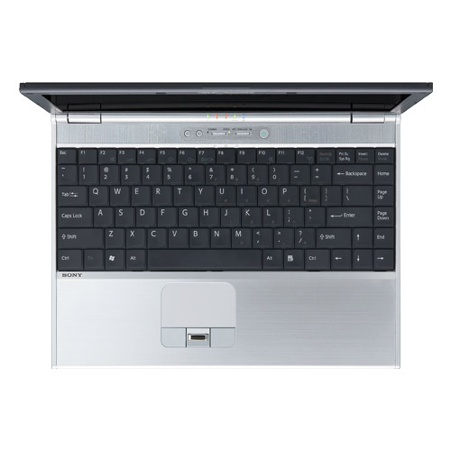
Sony gets it right. That is the perfect keyboard. Wonderful. Brilliant. Exquisite, even. Not a key out of place.
Admittedly, I don't know where Apple would put their confounded Apple/Command key. Maybe they could swap out the Windows Start Menu key for their Apple/Command key, and switch its position with the Alt key, tacking the word "option" onto the "Alt" key, of course, just to be perfectly clear that sometimes replacing the name of something is okay (Delete instead of Backspace) but sometimes just pulling new synonyms out of nowhere is okay too.
Key function mappings
Even if Apple gave us a standardized keyboard, their system-wide key mappings would still have to be fixed. Apple, please explain to me, why the Fn-Left Arrow key combination (for Home) and the Fn-Right Arrow key combination (for End) are mapped to a view-port function that scrolls to the top and bottom of a document, respectively? This makes no sense, whatsoever. You suck, Apple.
The trackpad button
Give. Me. Another. Button. Seriously, why is there only one button? One is simply not enough. There is no analog for a middle-click. Stupid, stupid, stupid. It makes me angry just thinking about it. This super-idiotic single-mouse button idea very nearly cripples power-users.
The menu bar
The Mac operating system's menu bar is simply bad design. Every other modern operating system I know of keeps the menu bar containing application menus attached to the main window of the application. Why? What is the benefit of this? Well, the answer to this is not instantly obvious, until you want to use two monitors. If I chain my monitors in Mac OS X, the menu bar gets positioned at the top of one of the monitors -- the one you specify as the main monitor. This means that if I want to use an application on the secondary monitor, and I want to say, I dunno, mouse execute any menu item command without a key-combo shortcut, I have to actually mouse over to an _entirely other monitor_ to get to the menu. What?! This is just plain *stupidity*. Horrible design. This is simply the worst, dumbest, and most arrogant mistake I've ever seen in a modern operating system, period.
Window frame grabbing and resizing
I should be able to grab the corners (all four), the sides, the top, or the bottom of any window and resize it. All modern operating systems support this. The absence of this feature seems to be part of the legacy of MacOS 1-9, the window resizing capabilities of which also sucked.

Rationalize window hiding/showing min/maximization
There should be some way to single-click minimize any window, and also single-click maximize that same window without moving the cursor at all.
iChat buddy lists arrangement
The user should be able to arrange their buddy lists however they see fit. I personally would love to have my buddies from all chat protocols on one big list. I should be able to organize them however I choose: alphabetically by first name; by last name; by network; by e-mail address; hell, by birthday; or any combination thereof.
Text drag-and-drop in TextEdit
Type, type, type... select, drag... scroll?? Why can't I drag this dang text out of this freaking document? No reason. I just can't.
Program interfaces are not uniform
Despite Apple's hard push of their interface best practices onto developers through the Apple Human Interface Guidelines, applications on the Mac often elude expectation and intuition. The differences in the behavior of common interface components between programs (both third-party and Apple) are too many to enumerate.
More to come, I'm sure...